


January 21, 2021 - 6:02pm
We’ve been in this third national lockdown for nearly three weeks now. Covid-19 deaths are at an all-time high: 1,800 were reported on Wednesday. Schools are closed, bars are closed, we can’t see our friends or family.
It is pretty disheartening, therefore, to read that there is “no evidence of a decline” in infections since the lockdown began. The headlines are based on Imperial College’s excellent REACT-1 study, a survey that randomly samples the population and estimates the total prevalence, just as an opinion poll estimates voting intentions.
The headlines are, on the face of it, correct. The most recent REACT-1 data, round 8a, covering the period 6 January to 15 January, found about 1.58% of its respondents to be positive. Round 7b, the one before, found only 0.91%. That’s an increase of well over 50%, and all ages and subgroups showed a rise.
But there’s a wrinkle. Round 7b took place from 25 November to 3 December, well over a month earlier. Normally REACT-1 does its work every couple of weeks, but they seem to have taken Christmas off, understandably enough.
That means that we’re not looking at how the infections have changed since lockdown; we’re looking at how they’ve changed since the end of the last lockdown, which ended on 2 December. Presumably cases were pretty low then. In the meantime, we’ve had an easing of restrictions, a one-day Christmas free-for-all, and the rise of a new and more transmissible variant. The big gap towards the right of the graph below is the area of missing data; it could be that cases were steadily rising, or it could be that they shot up in December and have slowly declined again since lockdown.
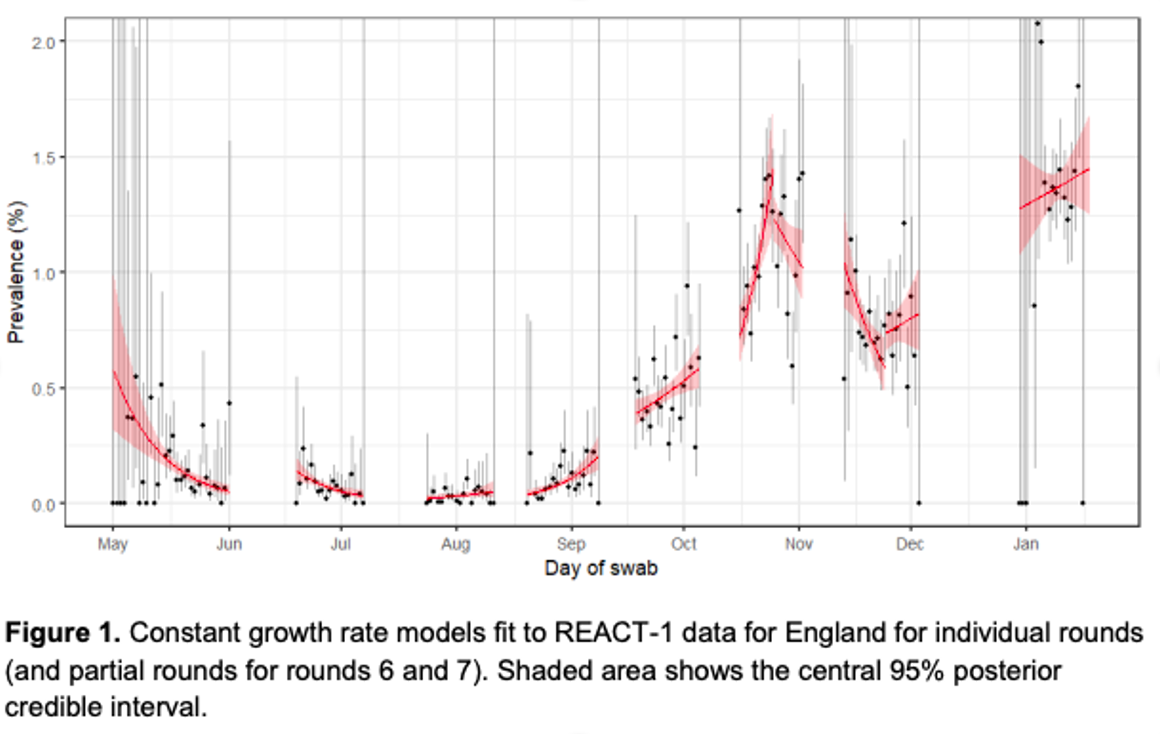
REACT-1 takes its samples over several days, and tries to make some estimate of how things are changing from the data collected on those days — the little red line in the rightmost collection of dots is their best guess at the trend. But Kevin McConway, a professor of statistics at the Open University, tells me that the uncertainty intervals around them are huge — the red-shaded area could fit a line going steeply up or a line going steeply down.

Join the discussion
Join like minded readers that support our journalism by becoming a paid subscriber
To join the discussion in the comments, become a paid subscriber.
Join like minded readers that support our journalism, read unlimited articles and enjoy other subscriber-only benefits.
SubscribeZoe peaking around 1 Jan, hospitalisation data around 14 Jan, deaths by date of death appearing to be heading for a peak around 18 Jan. Given the respective lags these all suggest firmly that infections started to fall around late December, and have continued falling. Is there some subliminal psychological resistance among analysts to data observations that indicate the virus may behave independently of government policy initiatives?
That is an excellent observation!
Thanks. It’s genuinely baffling. The third wave has clearly peaked, and yet we don’t seem to be able to welcome good news.
Great post. Thank you. Zoe data really does seem to be a week or more ahead of anything government issues but even the official data published daily on the gov website shows we are past the peak of infections! Using this data the location where I live now has an inflection rate lower than the summer! It feels like mass psychosis which I think Tom is part of.
In other words, nobody has a clue, which we have known for months, especially given all the false positives from PCR testing and false negatives from lateral flow testing. Meanwhile, they implore use to ‘Stay at home’ which is where most people contract Covid.
Indeed, nobody knows anything at all, which is extremely frustrating. Should more of the general public understand the impact of false positives, the use of the PCR test and CT levels, the outrage would be greater. Sadly, many don’t or can’t, and some don’t want to know sill blindly believing Government. That said, some do know and are made out to be cruel, granny killing individuals for questioning the ‘narrative of fear’ that is spewed out daily by the unquestioning media. Not knowing much about the REACT study I can’t really comment but the fact it’s a survey should encourage a healthy dose of scepticism no matter the results. The only reason for a lack of hard data detailing location of infection – hospital or community, death from rather than with Covid and this broken down by underlying cause (obesity/ diabetes, immune issues etc) and I could go on – is that it is likely to show that the vast majority of people are not at risk at all and should go about their daily lives. Raw data hospital numbers are showing an increase but even then Public Health England lump in “those admitted to hospital with known Covid” alongside “number of patients testing positive in hospital within the past 24 hrs”. Full disclosure of the real number is needed along with discharge numbers and discharge location. Without full data it’s all meaningless.
Now I’m not a fan of lockdown (not very effective, massive collateral damage and curtailment of liberties).
But the testing thing? The governments own testing regime sometimes over 600,000 a day returns pretty consistent figures, with positivity rates not jumping hugely day to day, but changing over time.
Even if the false positive rate was 10% (it’s probably under 1%) then this figures would still be useful as long as they were consistent.
I’m more worried about the medias buy in to the pro lockdown argument – largely parroting that lockdowns have solely reduced infections, a brief look at the government’s own charts consistently shows otherwise, in the current case infections peaked on 1st Jan – despite much higher testing after then. This lack of investigation or outright lying isn’t good.
Probably under 1%? I think the following example sheds doubt on that;
‘A friend of mine just tested positive for COVID. But out of every 1000 people who do NOT have COVID, 5 of them will test positive anyway. So how likely is it that my friend’s test is a false positive? If you said “0.5%” then (1) you’re wrong, but (2) you’re in good company, lots of people, including lots of doctors, {and Matt Hancock} give that answer. It’s a textbook example of the ‘base rate fallacy.’
To get the right answer you need more information. I’ll illustrate with the relevant real-world numbers.
My friend lives in Berkeley, CA, where, at the moment, about 2% of people who get tested have COVID. That means that when 1000 people get tested, about 20 of them will be COVID-positive and will result in a positive test. But that leaves 980 people who do NOT have COVID, and about 5 of them will test positive anyway (because the false positive rate is 0.5%, and 0.5% of 980 is 4.9). So for every 1000 people tested in Berkeley these days, there are about 25 positives and 5 of those are false positives. Thus there’s about a 5/25 = 1/5 chance that my friend’s positive test is a false positive.
(That’s if we had no other information. In fact we have the additional information that he is asymptomatic, which increases the chance. He still probably has COVID, but it’s very far from the 99.5% chance that a naive estimate would suggest. Maybe more like a 65% chance).
If you think about this issue once, it will be ‘obvious’ for the rest of your life. Of course the answer to the question depends on the base rate! If literally nobody had the virus, then every positive would be a false positive. If literally everybody had the virus, then no positive would be a false positive. So it’s obvious that the probability that a given positive is a false positive depends on the base rate. Then you just have to think through the numbers, which is really easy as I have illustrated above’.
Since Imperial College don’t double test the asymptomatic to eliminate high false positives that occur at low viral load, and refuse to publish the Cycle Threshold they use to allow verification that it is below acceptable maximum (which is to say, comply with WHO guidance on test protocol for minimising high false positive rates), what is the basis for claiming that their study is “excellent”?
You throw a noodle of pasta at the wall and if it sticks it is done. I am sure they have some similar, simple and elegant, method of figuring out covid prevalence.
Surely the false positives issue/narrative was only relevant during the summer when cases were relatively very low indeed and an unknown % may have been false ones anyway? Unless you think the tests have become less reliable, so the % of false positives has increased or just jumps about randomly? The hospitalisation and death numbers do not support the ‘it’s all/largely false positives’ argument, as any objective comparison of the cases, hospitalisations and deaths charts would testify.
Thanks Tom Chivers, a great article.
One would hope that in performing this study (partnered with the NHS & Mori) Imperial would put out a mature press release.
I worry that somebody there is more interested in getting headlines than helping inform. Indeed many, but in particular Imperial have pushed pro lockdown agendas hard. People like to claim that they’re ‘right’ – look at their predictions and it’s doom and gloom everywhere – they’re like the economist who predicted 8 of the last 2 recessions.
Hey, I agree with you. I need to take my own temperature quickly.
This is a real study instead of a political study.
I’d hope the Imperial study team are rather embarrassed at the spin put on their work by their press office. It seems pretty obvious that there was a peak in cases at the start of January. The official figures show that the 7 day rolling average of cases peaked on 1 January, despite a huge increase in daily testing from early January that tends to disguise this. The number of covid hospital admissions also looks to have peaked on 9 January and the latest figure on the BBC website shows a fall of 452 patients in hospital for 19 January. The rolling average for deaths is still increasing, but the curve here again looks to be peaking.
All of this data is based on a massive (albeit not random) sample of cases and actual people in hospital and, sadly, dying. It is also internally consistent with past evidence on the lags between infection, hospitalisation and death. Am I missing something?
The rolling average for deaths was decreasing, and below the 5 year average – at least, according to PHE data published in The Telegraph at the weekend. Are you saying it has changed significantly since then?
The rolling average for deaths attributed to covid, as shown on the government website.
Didn’t read this before my comment.
Seems entirely logical to me.
In fact it seems safe to say “Cases started falling sharply before lockdown due to public action”. As opposed to Imperials “Cases still rising despite lockdown”.
Suggest also the ONS figures. These are a little strange in that their death rate includes people who were not tested for Covid before they died but had Covid on the death certificate.
I really understand that the idea is a bit weird but they do show the figures coming down.
If the hospital admissions are falling, which they are, then infections must have fallen 7-10days before, which they were. Why is this even an issue? Now when these variables are indisputably falling, Boris has to invent another scare variable, death rate. Although hospital data suggests no difference in mortality rate, imperial dudes have rocked up with another model that suggest that it may. I am amazed by this Orwellian propaganda machine. It is more impressive that its North Korean colleagues.
Are you taking into account the fact that deaths with Covid are registered as from Covid in hospitals?
Should be a source of huge embarrassment for an institution like Imperial that they allowed that suggested conclusion to be published. The authors supported it in the media rounds they did as well. Astonishingly basic errors.
Their conclusion seemed to be based on the hypothesis that the new strain is more infectious therefore lockdown cannot work, rather than the actual data they collected which was, as this article states, impossible to draw any conclusion from.
https://peerlessreads.s3.us…